Reading time: 3 minutes | Difficulty: Beginner
Overview
Choose color schemes for your standalone payment pages to match your brand. This guide covers color customization options.
Prerequisites
- A payment form with Payment Page enabled
- Understanding of your brand colors
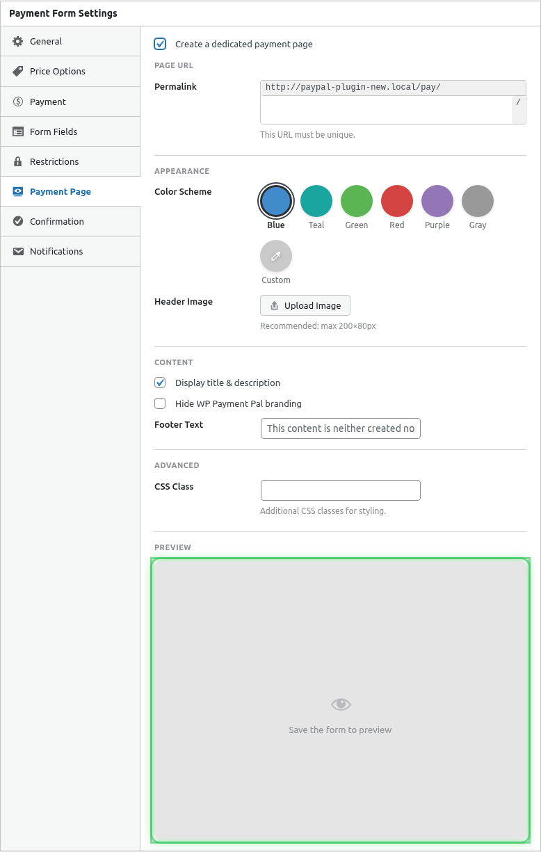
Accessing Color Settings
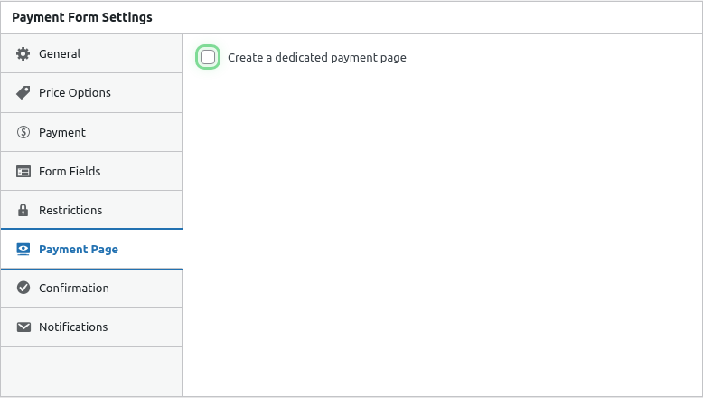
- Edit your payment form
- Click the Payment Page tab
- Find the Background Color section
Color Options
Preset Color Schemes
Choose from professionally designed presets:
| Preset | Best For |
|---|---|
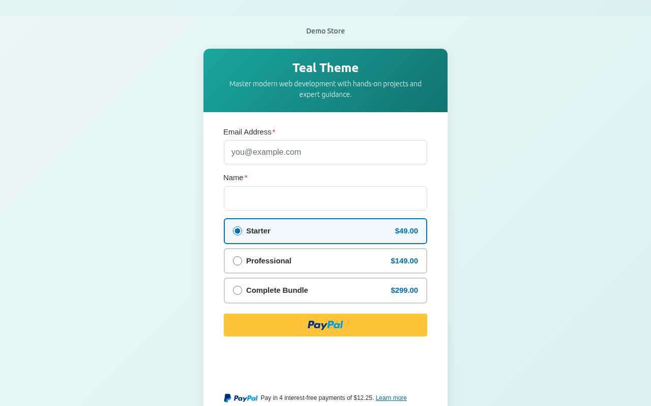
| Teal | Professional, trustworthy |
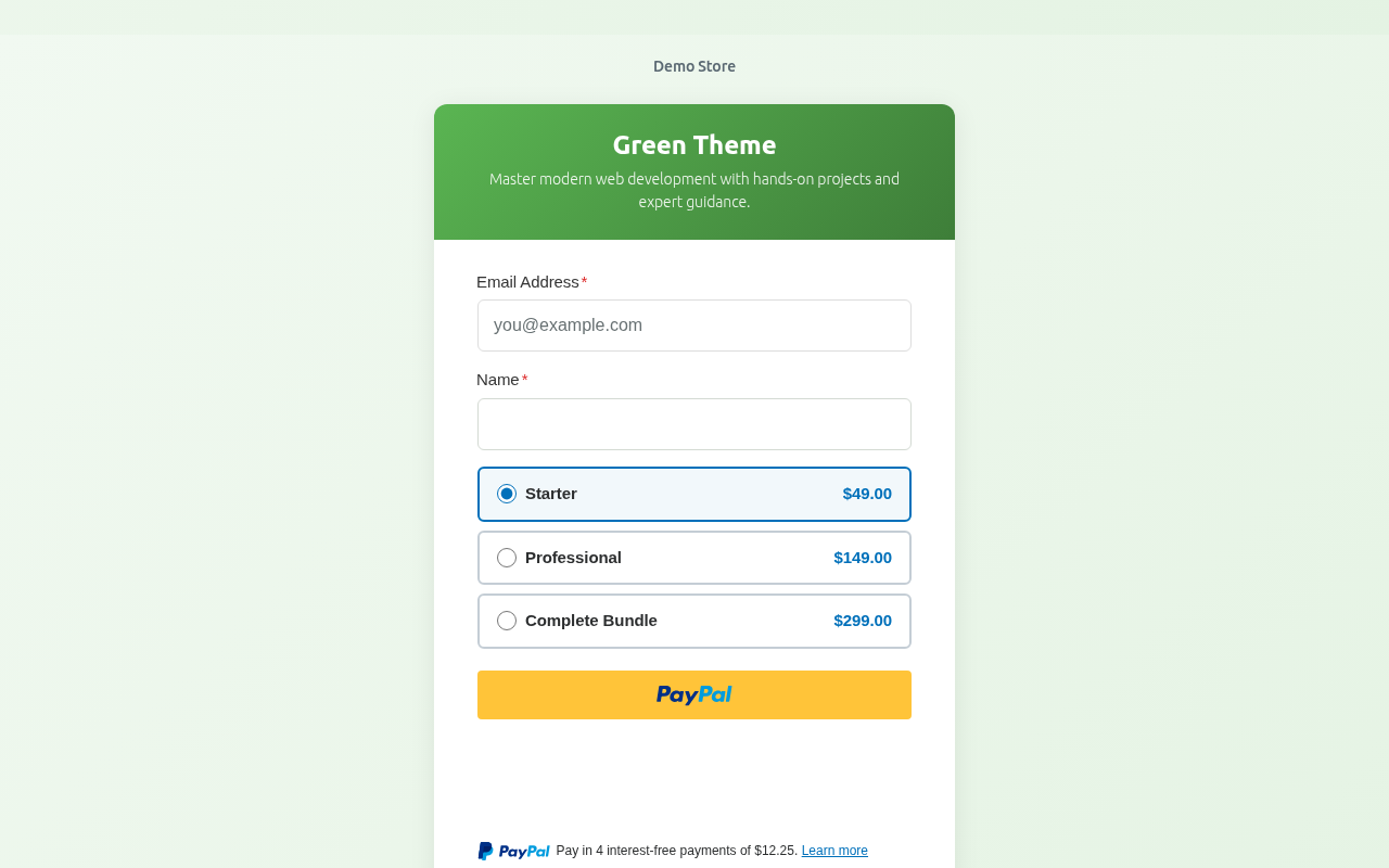
| Green | Eco-friendly, financial |
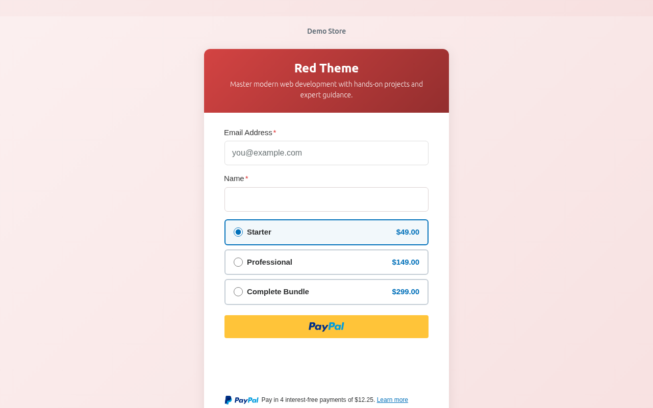
| Red | Urgent, passionate |
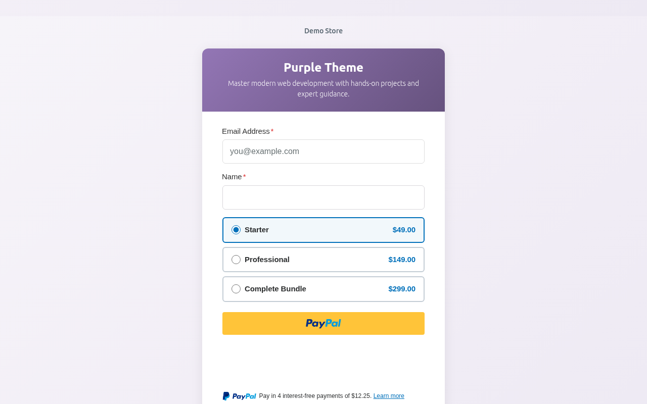
| Purple | Creative, luxury |
| Blue | Corporate, calming |
| Orange | Energetic, friendly |
Color Examples
Teal:
Green:
Red:
Purple:
Custom Colors
For exact brand matching:
- Select Custom Color
- Enter your hex code (e.g.,
#1a5f7a) - Or use the color picker
Color Psychology
Choose colors that align with your purpose:
| Color | Associations | Good For |
|---|---|---|
| Blue | Trust, stability | Finance, corporate |
| Green | Growth, health | Eco, wellness, money |
| Red | Urgency, passion | Sales, charities |
| Purple | Luxury, creativity | Premium, artistic |
| Orange | Friendly, energetic | Casual, community |
| Teal | Professional, calm | Services, tech |
Live Preview
Watch your changes in real-time:
The preview updates instantly as you select colors.
Color Accessibility
Consider accessibility when choosing colors:
- Ensure sufficient contrast
- Form card remains white for readability
- Text stays dark for legibility
- PayPal buttons are standard (not affected)
Brand Matching
Finding Your Brand Colors
- Check your website’s CSS
- Look at your logo colors
- Reference your brand guidelines
- Use a color picker tool on existing materials
Hex Color Format
Enter colors in hex format:
- 6 digits:
#1a5f7a - 3 digits shorthand:
#fff - With or without
#prefix
Gradient Effects
The background applies a subtle gradient effect for visual depth. The color you select is the primary/dominant color.
Combining Colors
Color + Logo
Your logo appears over the background:
- Light logos work on dark backgrounds
- Dark logos work on light backgrounds
- Consider logo visibility when choosing
Color + Content
The form card is white, so:
- Any background color works
- Text remains readable
- Consistent user experience
Testing Colors
Desktop Preview
View at full size to see the effect:
- Background fills the screen
- Form card is centered
- Logo displays above form
Mobile Preview
Check mobile appearance:
- Color should work on smaller screens
- Ensure readability maintained
- Test actual device if possible
Seasonal Color Changes
Update colors for:
- Holiday promotions (red/green for Christmas)
- Seasonal campaigns (pastels for spring)
- Special events (team colors)
- Brand refreshes
Multiple Forms, Different Colors
Each form can have unique colors:
- Product A: Blue (corporate)
- Product B: Green (eco-friendly)
- Donations: Red (urgent appeal)
Saving Colors
- Select your color
- Check the preview
- Click Publish or Update
- View live page to confirm
Resetting Colors
To return to default:
- Select a preset color
- Or clear custom color field
- Save the form
Troubleshooting
Color not appearing
- Ensure Payment Page is enabled
- Save the form
- Clear browser cache
- Hard refresh the page (Ctrl+Shift+R)
Color looks different live
- Monitor calibration differs
- Check without browser extensions
- Preview may have slight differences
Preview not updating
- JavaScript may be blocked
- Try refreshing the editor
- Check browser console for errors
Best Practices
- Brand consistency – Match your website/brand
- Test on devices – Check mobile and desktop
- Consider context – Match the payment’s purpose
- Accessibility – Ensure readability
- Keep it professional – Avoid jarring colors
What’s Next?
- Adding a Logo to Payment Pages – Branding
- Customizing Payment Page Layout – Layout options
- Enabling Standalone Payment Pages – Full setup guide